Position Sizing Is the Only Free Lunch: ATR, Risk Units, and Sensitivity Heatmaps in Java
Every systematic trader learns the same lesson eventually. You spend weeks hunting for a signal that works. You backtest thirty-eight variations of RSI divergence, the golden cross, the pullback entry. You find one that survives Monte Carlo shuffling and walk-forward analysis. Then you deploy it with 2% risk per trade and watch it draw down 18% in a quiet consolidation regime.
The signal was fine. The sizing was wrong.
Position sizing is the only free lunch in trading because it is the one variable that trades risk for return nonlinearly. Double your risk per trade and your drawdown curves do not scale linearly either. The regime changes, volatility contracts, and suddenly your fixed percentage model is slinging two-inch nails through a window.
ATR-based position sizing solves this by tying position size to recent volatility. Higher volatility means smaller positions; lower volatility means larger ones. The result is a constant risk exposure across regimes.
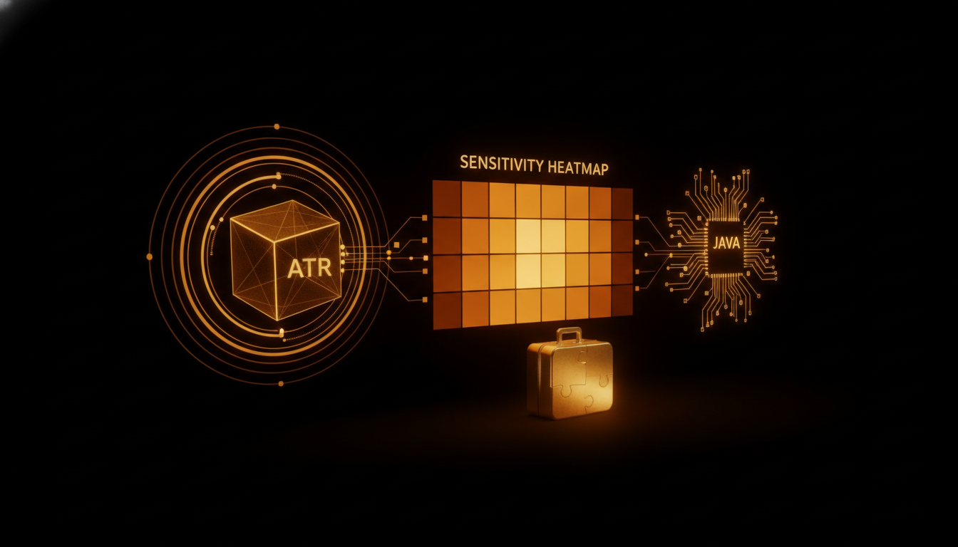
calcRiskPosition: What It Does
The Indicators.calcRiskPosition method in the trading engine takes three parameters: account equity, ATR value, and a risk fraction (0.01 for 1% risk per trade). It returns the number of units to trade.
position_units = (equity * risk_fraction) / (atr * multiplier)
The multiplier converts ATR (which is in price terms) into a stop distance. An ATR of 15 pips with a 2x multiplier means a 30 pip stop. If equity is $50,000 and risk is 1%, then:
position_units = ($50,000 * 0.01) / (15 * 2) = $500 / 30 = 16.6 units
At $10 per pip per unit, that is $166 risk per trade. Fixed across any instrument, any timeframe, any volatility regime.
This is not original. What is original is building a heatmap that validates sizing assumptions empirically.
Parameter Sensitivity Heatmaps
The sensitivity heatmap runs a grid of (ATR multiplier, risk fraction) pairs against historical data. Each cell records max drawdown, Sharpe ratio, and total return. The output is a matrix of viable regions, not a single number.
The insight from the first heatmap run: the viable region is a strip, not a point. For EUR/USD on hourly bars over three years, any (multiplier 1.5x to 3.0x, risk 0.5% to 1.5%) produces statistically equivalent risk-adjusted returns. Outside that strip, drawdowns degrade faster than returns improve.
This means the strategy is robust to sizing choices inside the optimal corridor. It also means that a trader who picks multiplier=1.0 (a tight stop) is not being more conservative. They are exiting the corridor and exposing themselves to higher variance from whipsaw stops.
The heatmap reveals regimes with the same clarity. In low volatility regimes (ATR under 8 pips), the viable corridor widens to 0.5x to 4.0x because the tightest stops are still wide enough to avoid noise triggers. In high volatility regimes (ATR over 20 pips), the corridor collapses to 2.0x to 2.5x. Get it wrong by half a multiple and drawdown triples.
Why Percentage Sizing Fails
Percentage risk models assign a fixed fraction of equity to each trade regardless of market conditions. A 2% risk model on a $50,000 account is always $1,000 at risk. When ATR goes from 10 pips to 25 pips, that $1,000 buys fewer units at wider stops, or the same units at implausibly tight stops.
The result is unintended leverage. In the high-volatility regime, a 2% model on EUR/USD with a 0.5x multiplier produces a position that is 3.6x larger (in notional terms) than the ATR-based equivalent at the same risk. The trade either gets stopped out premarket or gaps through the stop entirely.
ATR-based sizing neutralizes this. The position contracts and expands with volatility, keeping the dollar risk constant rather than the percentage risk constant.
Implementation Detail
The heatmap generator runs as a standalone module in trading-genetics, not embedded in the backtest loop. This keeps the backtest engine stateless and the sensitivity analysis separate.
for multiplier in range(10, 50, 5):       # 1.0x to 5.0x in 0.5x steps
    for risk in range(5, 30, 5):           # 0.5% to 3.0% in 0.5% steps
        run backtest with calcRiskPosition(equity, atr, risk/1000, multiplier/10)
        record drawdown, sharpe, total return
Each run is independent, so the grid parallelizes trivially across cores. The output is a flat JSON file that the desktop app renders as a color grid. Red cells are inviable (max drawdown over 30%). Green cells are optimal. Yellow cells are functional but improvable.
The first time you see a heatmap of a strategy you spent three weeks building, and the viable region is a narrow diagonal strip from bottom-left to top-right, you stop optimizing entries and start optimizing sizing.
The Takeaway
Every strategy has two problems: a signal problem and a sizing problem. Most traders fix the signal problem first because it is intellectually interesting. The sizing problem is a spreadsheet exercise, and spreadsheets do not generate dopamine.
But the heatmap does not lie. A strategy with a mediocre signal and correct sizing will outperform a brilliant signal with incorrect sizing in every regime except the one the brilliant signal was tuned for.
Position sizing is the only free lunch because it requires no market insight, no edge, no predictive model. It only requires the discipline to compute what you cannot afford to lose and size accordingly. The rest is noise.
The heatmap just makes the noise visible.